Word Organisation for Animal Health (WOAH) is a nonprofit organisation dedicated to improving global animal health to ensure a better future for all. Recognising the crucial link between animal health, human health, and the ecosystem, WOAH's mission is deeply rooted in this interdependence. It was imperative for us to weave this concept throughout the brand identity.
Client
World Organisation
for Animal Health
Industry
Nonprofit
Services
Brand Identity
Year
2021
Project with Decimal Studios
Motion Graphics by Croma
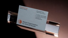
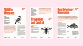
The approach to layout, typography and colour take inspiration from traditional printed newspapers. The dynamic grid system of horizontal and vertical lines not only serve as a cohesive visual element but they are also integral for structuring and distributing content across the broad range of applications.
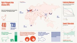
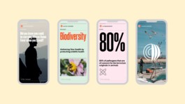
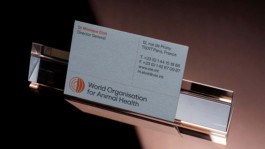
Brand guidelines, print and digital applications, as well as motion design were created to ensure all modes of communication were covered and the organisation had all it needed to embrace its new brand.
Word Organisation for Animal Health (WOAH) is a nonprofit organisation dedicated to improving global animal health to ensure a better future for all. Recognising the crucial link between animal health, human health, and the ecosystem, WOAH's mission is deeply rooted in this interdependence. It was imperative for us to weave this concept throughout the brand identity.
Client
World Organisation for Animal Health
Industry
Nonprofit
Services
Brand Identity
Year
2021
In collaboration with Decimal Studios
Motion Graphics by Croma
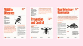
The approach to layout, typography and colour take inspiration from traditional printed newspapers. The dynamic grid system of horizontal and vertical lines not only serve as a cohesive visual element but they are also integral for structuring and distributing content across the broad range of applications.


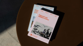
Brand guidelines, print and digital applications, as well as motion design were created to ensure all modes of communication were covered and the organisation had all it needed to embrace its new brand.

Please get in touch if you would like to discuss a new project or collaboration. Also here for coffees, collaborations, and new friends.
allie@allieheesh.com
(+34) 695 802 883
Instagram
Linkedin
Back to top ↑
©2025 — All Rights Reserved
Office Hours ● 09:30 —18:30 (CEST)
Please get in touch if you would like to discuss a new project or collaboration. Also here for coffees, collaborations, and new friends.
allie@allieheesh.com
(+34) 695 802 883
Instagram
Linkedin
©2025 — All Rights Reserved