Jenna Burlingham
A gallery specialising in Modern British & Contemporary art.
To coincide with their relocation to an 18th-century house, Jenna Burlingham Gallery required a re-brand to support their growing reputation as discerning curators of Modern British art. We worked with their team to re-position all of the gallery's communications, beginning with a strategy process that led to clarifying their uniqueness as curators and ending with a serious, striking & timeless solution for their refreshed identity.
Our solution was an identity system that puts more emphasis on Jenna Burlingham as the curator of the art and less emphasis on the 'Gallery' descriptor. By splitting the title top and bottom of all layouts, the identity literally curates what falls within the frame. 'Gallery' may be swapped out for alternative titles when the application calls for it. Sainte Colombe, a modern serif typeface based on a British classic, was an appropriate choice for the logo and primary typeface throughout the identity. Used primarily at large sizes, it allows communications to feel light and approachable, with subtle elegance.
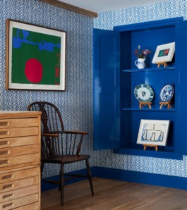
The corporate colour palette is inspired by the interior colours that are more fresh and modern than the typical 'neutral' colours associated with art galleries. A secondary colour palette and system is introduced for individual artists exhibitions, adding variety to the communications.
Client
Jenna Burlingham
Industry
Arts and Culture
Services
Brand Identity, Signage, Editorial Design
Year
2021
Typefaces
Sainte Colombe by Production type
Project with Studio Dennis


Jenna Burlingham
A gallery specialising in Modern British & Contemporary art
To coincide with their relocation to an 18th-century house, Jenna Burlingham Gallery required a re-brand to support their growing reputation as discerning curators of Modern British art. We worked with their team to re-position all of the gallery's communications, beginning with a strategy process that led to clarifying their uniqueness as curators and ending with a serious, striking & timeless solution for their refreshed identity.
Our solution was an identity system that puts more emphasis on Jenna Burlingham as the curator of the art and less emphasis on the 'Gallery' descriptor. By splitting the title top and bottom of all layouts, the identity literally curates what falls within the frame. 'Gallery' may be swapped out for alternative titles when the application calls for it. Sainte Colombe, a modern serif typeface based on a British classic, was an appropriate choice for the logo and primary typeface throughout the identity. Used primarily at large sizes, it allows communications to feel light and approachable, with subtle elegance.
The corporate colour palette is inspired by the interior colours that are more fresh and modern than the typical 'neutral' colours associated with art galleries. A secondary colour palette and system is introduced for individual artists exhibitions, adding variety to the communications.
Client
Jenna Burlingham
Industry
Arts and Culture
Year
2021
Services
Brand Identity, Signage, Editorial Design
Typefaces
Sainte Colombe by Production type
Project with Studio Dennis


